
October is here! And Meagan's Creations has finally opened shop at Scrap Matters with all your favourite kits! The store is on sale for 30% and the bundles are already 40% off! Here's a glimpse of what you'll be able to grab there.

Meagan is participating in Mix A Kit at Scrap Matters this October. Her pieces are called My Favorite Things which have stunning blues, pinks and yellows! Each piece is very elegant, will work with all kinds of photos and is on sale for 30% off.
Check out the beautiful MAK pieces Meagan's Creations has in store (pun intended ;) ) for you.
 And here are the individual previews (all linked to the store):


The journal cards (A set of six 5.88" x 3.88" journal cards) make a beautiful way to journal on and alternatively, you can use it to make a hybrid project and fancy cards.
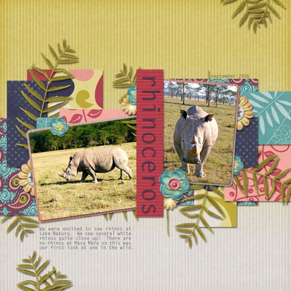
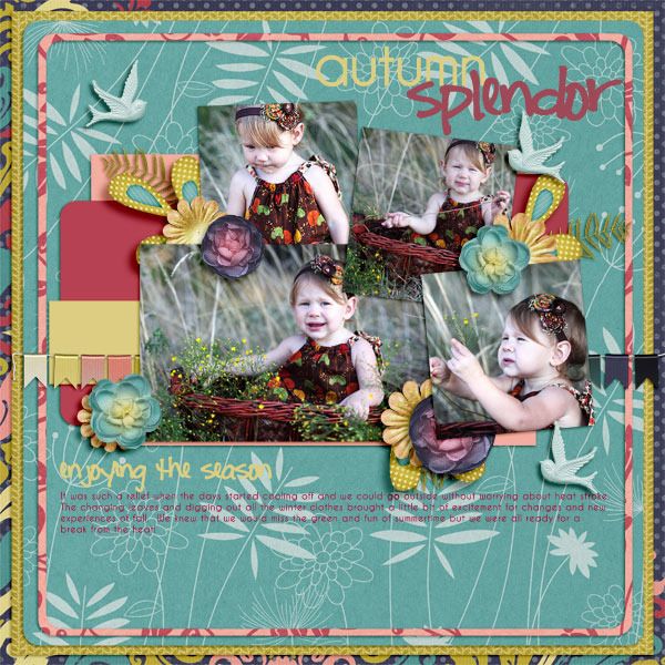
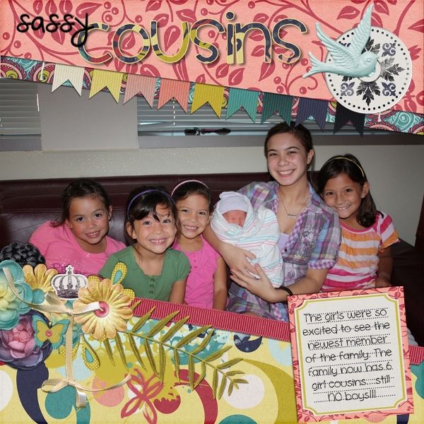
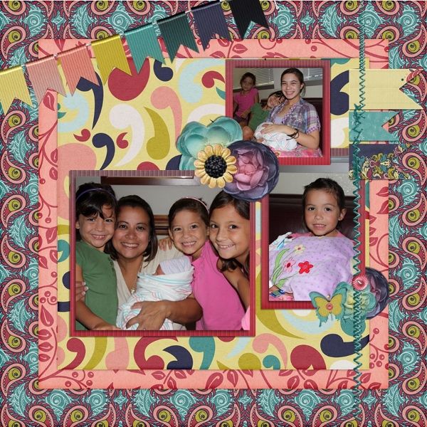
And here are some of the wonderful layouts by Meagan's CT:
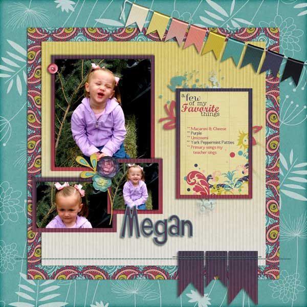
Lahni:

Belinda:

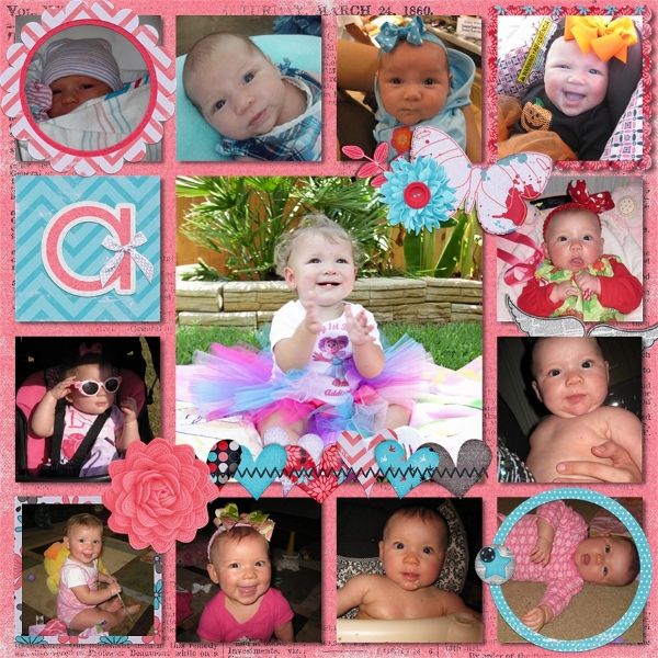
Dana:
Stephanie:
Laura:
Lauren:
Lindsay:
Kandice:

Kendra:
 She used Meagan's Squared Away templates (Gotta Pixel store)
Finally, what everyone has been anxiously waiting for. The winner who correctly guessed Meagan's new store is....


...Sarah!! Congrats girl! Please contact Meagan at meagan2t@gmail.com.
Thank you all for participating and we hope you keep dropping by for more chances to win and some great kits. Happy shopping!

(linked to the scrap matters store)
Meagan is participating in Mix A Kit at Scrap Matters this October. Her pieces are called My Favorite Things which have stunning blues, pinks and yellows! Each piece is very elegant, will work with all kinds of photos and is on sale for 30% off.
Check out the beautiful MAK pieces Meagan's Creations has in store (pun intended ;) ) for you.
And here are some of the wonderful layouts by Meagan's CT:
Lahni:
Belinda:
Dana:
 |
| template by Little Bit Shoppe Designs |
Laura:
Lauren:
Lindsay:
Kandice:
Kendra:
Finally, what everyone has been anxiously waiting for. The winner who correctly guessed Meagan's new store is....

...Sarah!! Congrats girl! Please contact Meagan at meagan2t@gmail.com.
Thank you all for participating and we hope you keep dropping by for more chances to win and some great kits. Happy shopping!


.JPG)


